Work//
Exhibition Catalogue Layout & Design / Graphic Design
art+château is a not-for-profit based in Bern, Switzerland working with both emerging and established artists from around the world to present contemporary art in historic settings.
Task
The assignment was to create a bilingual exhibition catalogue for art+château’s exhibition at the stunning Oberdiessbach castle, the design needed to be simple and clean — a format and look that could be applied to future exhibition catalogues.
Approach
Needless to say, the practice of displaying contemporary art pieces in communication with an historic environment, made it essential to show the pieces in their environment. We chose an A4 landscape format to allow for the beautiful room photographs shot by Claudia Christen to be shown on a large scale. We paired a utilitarian sans serif heading with a traditional serif font for the body text, in keeping with the juxtaposition of the contemporary in the historic environment.
Outcome
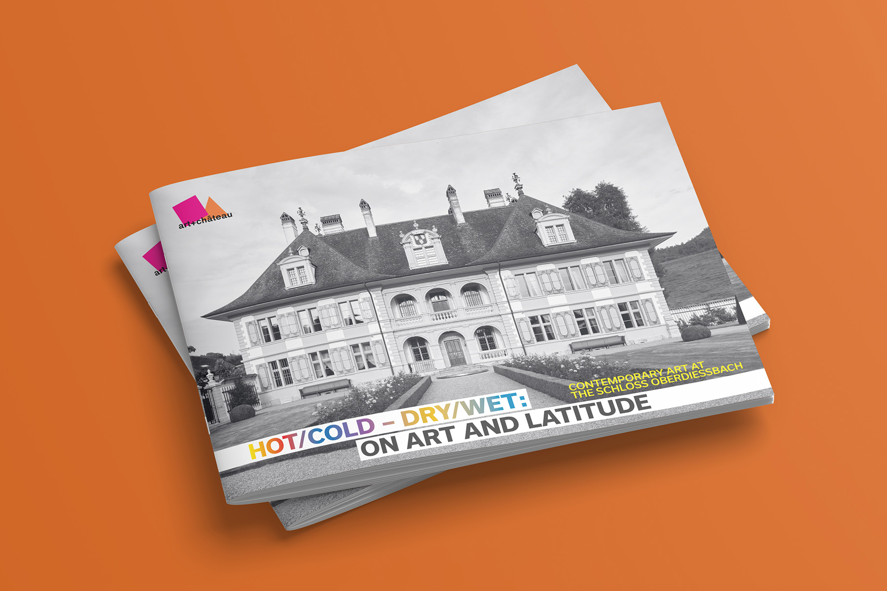
The cover design, a monochrome photograph of the castle combined with the modernist font, introduces the dynamic polarity from the beginning. The specific theme of the exhibition, “Hot/Cold – Dry/Wet: On Art and Latitude” is highlighted with a gradient. The layout is spacious and does not distract attention from the images. The catalogue was ordered by room, allowing the reader to go on a journey through the castle and the grounds. Resulting in an effective documentation of the experience of the exhibition.